
Student Work 2022-2024
Digital Advertisements
Click to read about this SOCIAL MEDIA GIF AD
This project was to be a social media ad to educate the TA and be a call to action to get the audience to order ice cream from that brand. This was the message that I decided to send: Get your mom to order tasty, healthier ice cream for you.
I feel this ad shows how I can edit a complex message down and use color and animation effectively.
The target market of Scoop Shoppe was broad and included:
- Families with children, particularly health-conscious parents who purchase high-quality organic goods for their family
- Teenagers
- Busy, health-conscious adults who appreciate the niche ice cream market and like the idea of being able to order online
- Individuals who are vegan or have lactose-related dietary restrictions
The design needed to have:
- Imagery should include children/teens and reflect racial and ethnic diversity.
- There should be simplicity in design and message.
- It should be easy to read call to action.
I had to use the below copy for the ad. I had the ability the severely edit the copy:
- Made with care in our kitchen for udderly creamy perfection.
- Our products are free of artificial flavors, preservatives, emulsifiers, and stabilizers.
- Vegan and lactose-free varieties available!
- Call-to-action button text: Order NOW!
- Our artisanal ice creams are handcrafted in small batches.
- Order a quart online and get a free sample of our daily special!
Images, colors, and fonts were provided.
My decisions for this project were based on the TA, client needs, the product, and its market. I decided to aim my design at the target audiences of: Families with children, particularly health-conscious parents who purchase high-quality organic goods for their family and teenagers. When editing the copy I decided to focus on the call-to-action text and on the benefits of eating artisanal ice cream over eating ice cream that is commercial and artificial. I decided I wanted an ad that was attractive to children, so I picked the youthful imagery. Additionally, I felt the arm without other information was inclusive to all children regardless of gender or ethnicity. My attempt at inclusivity would help with attaining diversity. I focused the ad onto the one image, and I severely edited the copy to be short messages to keep simplicity. I also used repetition of the circle/scoop shape to unify the message with the ice cream and it kept it simpler than if I brought in other shapes. The CTA was large and clear. Brand Logo was obvious and in the top left corner where people expect to see it in a digital platform. I use good left and balance around the central image of ice cream. I needed to make sure the TA saw everything. I played around with exaggerated proportions for emphasis of the CTA and on the ‘excitement’ (exclamation point). I used the high contrasting colors of the brand throughout the design for visibility and readability.
Image Attributions
Daniel Cuklev. Rice Noodles. Foodiesfeed.com, n.d. foodiesfeed.com/free-food-photo/rice-noodles-with-roasted-vegetables/
Georg Regauer. Vegetable Salad on Brown Tray. Unsplash.com, 5 July 2021. unsplash.com/photos/vegetable-salad-on-brown-wooden-tray-qo0qBl6T7R8
Kelli McClintock. Brown Cardboard Box. Unsplash.com, 10 Nov 2019. unsplash.com/photos/brown-cardboard-box-DcoB_NoNl6U
RF._.studio. Person Cutting Peppers. Pexels.com, 8 Jan 2020. pexels.com/photo/photo-of-person-cutting-bell-peppers-3621212/
Click to read about this WEB PAGE AD AND SOCIAL MEDIA CAROUSEL
These are digital artifacts from a multi-channel advertising campaign. (See Magazine Ad at the bottom of this portfolio for the complete campaign). Fonts, brand colors, brand shapes and brand guidelines for imagery were provided. By following the brand keywords, I used the image content to attract the audience with ethnic diversity and no reinforcement of social norms or gender roles.
This GIF and social media carousel ad are part of a multi-channel ad campaign. They needed to be cohesive with all three forms of ads the client needed. Since they are ads, they needed to be creative to catch the TA’s attention, hold the TA’s attention, and make them sign up for the meal kit service of Fresh Fare Farms. They function in two different contexts around the internet.
I feel this GIF and social media carousel represent another of my best digital advertising work because I feel they show my critical thinking and problem-solving skills as applies to creating cohesiveness between ads in a campaign. I also analyzed the messaging the client wanted, and I strategized what could happen in a small, simple space; as well as my skill to understand how to make a small ad that has a lot of required parts legible and readable. In the social media carousel, I strategized what could happen in a continuous, seamless space; as well as my skill to understand how to make a seamless set of ads.
Both designs have the same TA: College students and young professionals who are too busy to go grocery shopping and meal plan, who want to eat healthy or learn to cook healthy food, and are between 21-35 years old.
The GIF ad tells the beginning of the service story of delivering ingredients. It had to be simple with an animated CTA. It had to have good contrast for visibility and good legibility and readability because it has to be seen within any website content. The strategy for the messaging in the GIF was completely different from the other ads in the campaign, because of its size. This ad focuses on the single core message, the message to gain more customers. Headline and body copy are short, and I broke it into two parts: the CTA part and the benefit of signing up for the service for the TAs’ community. The same tagline appears here as in the other two ads because it’s short and adds a bit more consistency across all three types of ads. The single message in the GIF is in the images and stresses delivery of fresh, healthy food. I used the images to explain the service. Essentially, the service has a beginning, middle, and result, which lends itself to the pattern of storytelling. This GIF illustrates the primary service the TAs want—food without the planning and shopping effort. The CTA is now an interactive button which is animated simply to grab the TA’s attention from the other distractions on the internet because it is such a simple movement. It follows good UX practices by also clearly stating what they should do so the TAs know how to sign up. This GIF design is repetitive of the other designs in the campaign, so the TAs are exposed at least three times to the message across channels and media.
The social media carousel had to tell the whole story from delivery, to cooking, to ready to eat. It had to be seamless to encourage the TAs to swipe, and I made it seamless by telling one story. Plus, there are some shapes that I used in the same way, with the same placement and in the same colors. Additionally, the headline is the same continuous message across the three canvases. Lastly, the shapes in the three canvases flow across the designs. It had to have good contrast for visibility and good legibility and readability because it’s in social media. These social media ads tell all the key points of the service and keep the ad image-driven for the young TAs. No other message was added because these ads needed to be simple and clear and not look like other posts around them. The ads are more visually interesting for the TAs in a digital environment. However, with the copy given, the text call to action is in the last canvas, therefore, I added a bright lime seed shape on all the canvases, on top of all the other content, and touching the logo. It has high contrast with high contrast text inside and it echoes the headline CTA. I focused the ad on the call to action to get more consumers to be purchasers.
The visual aspects that I used to make the ads cohesive was to make them have the same “feeling.” The way I applied the design principles of contrast, scale, and unification to the ads is generally the same across the ads.
In the GIF, contrast is used with the brand shapes, brand colors, and the brand fonts– the two weights of Futura PT for the copy in different brand colors and I didn’t use the decorative font, Filmotype LaSalle because of legibility and readability in the small design for the TAs.
Scale is used for the images and text. In this ad though, I used the images that could be made larger and still be recognizable, so they had visibility in such a small design space and could tell the story of the service for the TAs. Proximity is used just for clarity and comfort of viewing for the TAs since the space is restricted. Unification happens with the use of the colors. Balance is bottom heavy to pull the TAs’ eyes down to the CTA. The CTA is emphasized as the main message to get more customers. The call to action is explicit, larger, and animated to catch attention and appeal to TAs. It needs to be seen. The white logo was used so it contrasted enough for the TAs to see it clearly in the small space. I created consistency and cohesiveness by following the brand style guide in my choice of colors, fonts, usage of the fonts, logo and usage of the logo.
In the social media carousel, the headline is the largest message in the ad. It’s at the top and follows natural eye flow and swipe flow so the TAs can continue reading it in the same place.
I used design principles such as contrast, scale, and unification but used proximity, differently than in the other ads, and added rhythm. Proximity is very strong in these ads This made the different parts interact with each other and harmonize as ideas. Unification kept the TAs knowing all three ads were together. Rhythm was added through the flow of the shapes to create the feeling of movement between the ads so one goes into the next, thus they are seamless and encourages the TAs to swipe.
Click to read about this WEB BANNER GIF
This web banner ad was designed as a companion for a magazine ad. The brief was to create a web banner that complimented and felt the same as the magazine ad, to market the dummy resort in a unique way.
Target audience and the message were all my choice and defined by me. I researched resorts in the Caribbean and did a sort of competitor analysis. I found out couples were the main TA of those resorts and that couples with children were not catered to very well. I chose to make the TA parents with children who wanted to bring their children on holiday but also wanted time alone and wanted to know their kids were safe. I focused my message on parents having free time because the selling point of the campaign was that the resort offered child supervision.
I also, chose to make sure my ad showed inclusivity by having models getting spa treatments and not showing many identifiable details. The “couple” could be anybody and their kids could have been anyone’s kids. Children were only visually referred to via the drawing of the sandcastle. Additionally, all the imagery within the design was created by me as was the color palette, except for the logo and brand purple. I focused my palette on complementary colors for contrast and so the colors pop out. The headline, tagline and call to action are unique to my design. This project focused a lot on the technicalities of editing photos and text in Adobe Photoshop and Illustrator.

Click to read about this BRAND IDENTITY for VIDEO GAME COMPANY
These branding designs were created together.
In the project, the information about the company was supplied, just like a live project. The professor acted as the client and I dealt with him as if he were an actual client, therefore, I sent him regular updates and gave him my rationales for my choices. He had final say in what the logo design was and presented his decisions as a real client would. I learned creating a brand is significantly different from the creation of marketing materials, like ads and social media posts for a company with already set branding.
On top of this, I had to complete visual competitor research for three competing companies. These were existing companies, while the company I was branding was a dummy company. Visual competitor research is unique to branding because the brand I’m creating has to fit with the industry and market standards, so the target audience will recognize the product and/or services offered by the company without any other knowledge.
I started by designing the brand logo from scratch in Adobe Illustrator. The logo is the base of all other branding decisions.
I used the supplied RacerX mission and vision statements, personality, and tone of voice, plus my visual competitor analysis results to inform my logo design choices.
The aspect which affected my decisions most was the brand personality of fun, light, and informal. I tried to make a logo which was fun by adding curved terminations to the wordmark and the brandmark. I also picked a font that was geometrically curvy and made the brandmark match the font curve. I also paid attention to the proximity of the wordmark and brandmark to have more tension than comfort, so it would add to the fun feeling. The colors were chosen also because they were fun. The orange is vibrant because orange means playful and enthusiastic which are the hallmarks of having fun, especially while gaming. The second color I chose was a blue since many tech companies use blue in their branding. I picked this specific blue-cyan because it is the complement to the orange for high-contrast.
The font I chose has open counters and eyes to reinforce the light feeling of the brand. It was also a decision to keep the word “racer” as all lowercase since lowercase is viewed as friendlier. The client’s personality was fun, light and informal and I interpreted that to mean friendly in general. To connote gaming, the general shape I made the X refers to racing because it looks like tracks.
From all the logo decisions, the Brand Style Guide is not only instructional on how to apply the branding and logo on various formats, it also feels fun, light, and informal. This is so another designer can follow the agreed upon interpretation of the brand because they can see how I applied it. I captured this feeling because I used lots of negative space, swooshing supplemental graphics that added rhythm and asymmetry, lowercase headings throughout and appropriate cover and section images.
On a technical note, the initial cover image had inappropriate content for a family-friendly professional organization which were alcohol bottles on the counter behind the people playing video games. I added pizza boxes and a paper bag to the image with Adobe Photoshop and blended them into the original to cover the bottles. Additionally, the image didn’t harmonize with the brand color-wise, so I changed the color of the two hats to be the brand blue. The brand style guide was designed to make the brand shine and stay shining during all uses. Adobe InDesign was the primary program used for the style guide.
Click to read about this DIGITAL EXHIBITION CATALOG
This was a digital exhibition catalog that would have been sent out as part of the exhibition invitation.
This was a technical layout project. The museum was a dummy museum and the text and photos throughout the catalog were supplied. I couldn’t delete anything, and it had to be translated into a print catalog, too. My design decisions were the whole organization of the catalog content within 12 pages or less. The hierarchy of text, the fonts, placement and size of images, color scheme and any branding applied, plus any extra images were up to me.
This version was optimized for 72 ppi and RGB color space. Optimization of design elements for different media was done in Adobe Photoshop. However, InDesign was the primary program used for layout. Technical requirements included proper pagination, 8.5″ x 11″ pages with facing pages. The spreads are 11″ x 17.” But, I had to choose the type of binding to accommodate for creep and folding to create the printed version of the catalog.
The catalog uses three grid structures– the Marber grid, a manuscript grid, and a symmetrical two-column grid. The color scheme was my choice from colors within the images in order to harmonize with the artwork. The hierarchy throughout the catalog was my choice so I could have the asymmetry and feel of nature to match the overall visuals in the artwork. I made the catalog feel like the artist’s work.
What content that went on what page was my choice. I had to create a hierarchy among the artworks because there was a page restriction of 12 pages maximum including cover and table of contents. I chose the three most colorful artworks to have individual spreads for attention purposes. Overall, I focused on the rhythm of the information and used scale and contrast to create the rhythm.
Additionally, there was a focus on aligning all content across the pages. Details were added such as the yellow flower as a design device to add visual interest, the font pairings (minus the museum logo), and the page markers and their placement.
Other Digital Works
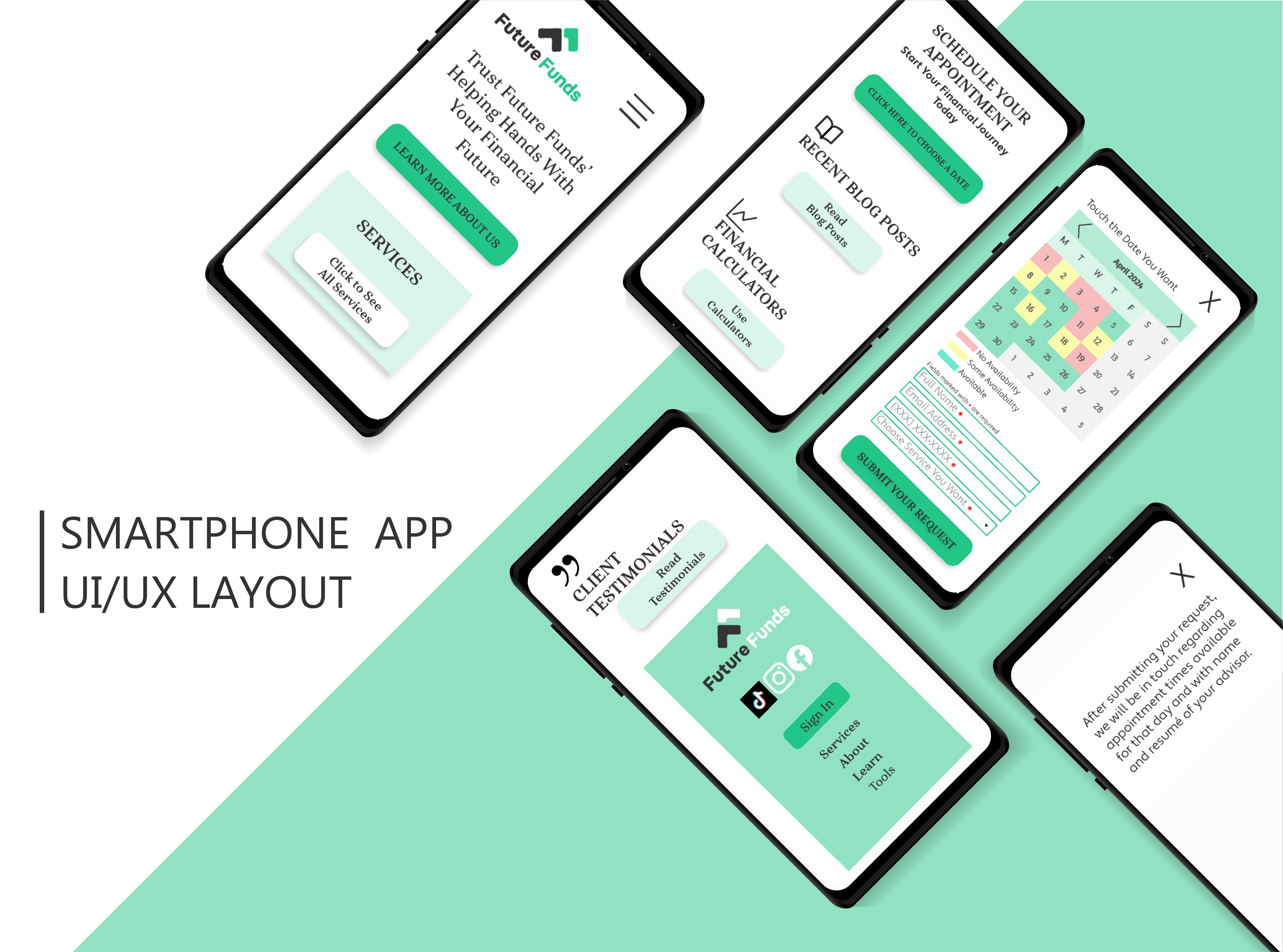
Image Attribution
Christina Morillo. Two Women sitting at Table. Pexels.com, 22 June 2018. pexels.com/photo/two-woman-in-black-sits-on-chair-near-table-1181605/
Click to read about this UI/UX WEBSITE DESIGN
The purpose of this project was to redesign the interface for a financial advising company’s website for maximum UX/UI need. The original low fidelity wireframes for the design had issues with user-centricity, consistency, hierarchy, context, efficiency, and cognitive load from the test the first designer completed. My design result was to be a high-fidelity design that fixed all the initial problems and could be tested with users then refined to be sent to the coding team. Brand logos and colors were supplied. Target user data and personas as well as the initial testing results were supplied for analysis. I completed a competitor analysis of existing financial advising brands’ websites and services for this project. I could use tints and shades of the brand colors in my redesign. The hero image was my choice, and I chose a diverse image of a business consultation happening. This type of imagery is the industry standard. I also designed a detailed and actionable user testing plan with tree-testing and a task assessment test for this project.
A UX designer needs to consider that users are affected by the circumstances of the setting they’re using the website in. Context can and might get users distracted. Designers must defeat the distractions by making the website easy for the user to become oriented.
Overall, I followed the TA needs and desires for information as they decide on hiring the financial planner and I created a logical pattern for the organization of the content of the website. I made the hero section attractive and attention-grabbing as well as functional for the user. I also used the brand colors and logo to confirm to the user they are in the right website. I gave clear and obvious calls to action in the hero section and top nav bar to tell the user what to do. They also tell the user what they can do at the beginning of their journey. Additionally, I gave the sections a typographic hierarchy that tells the user what a section is about, and I gave buttons and labels that tell the user they could go find out more about the stuff in that section. I gave an image and a tagline that reinforced the helpful branding. This reassures them that Future Funds is the best financial planning service. The hierarchy is organized into levels and is consistent. All headings and button text are in a serifed font. All passive content is in a sans-serif font. Each content section has three items, follows a grid, has contrast with the background, but they vary in size and style within that pattern following the hierarchy. I gave the user affordances for what they could do everywhere they possibly needed to be. The affordances are designed in the simplest, most functional, or familiar way possible.
Furthermore, I followed Dan Brown’s principle of disclosure which states, I “should show only enough information to help users know what they can find if they go further.” Additionally, I used the principle of exemplars which states, I “should describe contents of categories by showing examples of contents.” I combined these two principles by adding affordances for users to see more if they wanted and I only used headings and icons to show the user enough information.
I also created a mobile wireframe for the website. It uses all the same principles I just discussed but the mobile format demands some changes for accessibility. First, I designed the desktop and the mobile websites to give the user the same experience in both contexts. The website is visually consistent between the desktop and mobile. I used logic for where other sections went but I further kept in mind that sections are dynamic and can change and move around. I made interactive elements like the buttons, logo, icon for the menu, all 1 cm x 1 cm. Icons to close, squares for dates are all bigger than 1 cm. I put a lot of space between the buttons, the logo, and other content. All of the things are bigger than they are on the desktop site to accommodate fingers instead of a mouse cursor. I also limited what was on the screen so everything could be larger and have more space. Therefore, the definition of “just enough information” changed to be less. I got rid of all the extra words and elements. I moved any extra to secondary screens. I took away the hero image. I focused the mobile site on the tagline that gave the complete marketing message. Because the website is used differently on the mobile and I wanted users to have the same experience in mobile and desktop, I used TA data and kept the hierarchy of the hero and services sections, then I used logic about the probability of the TA getting on the mobile site to schedule an appointment.
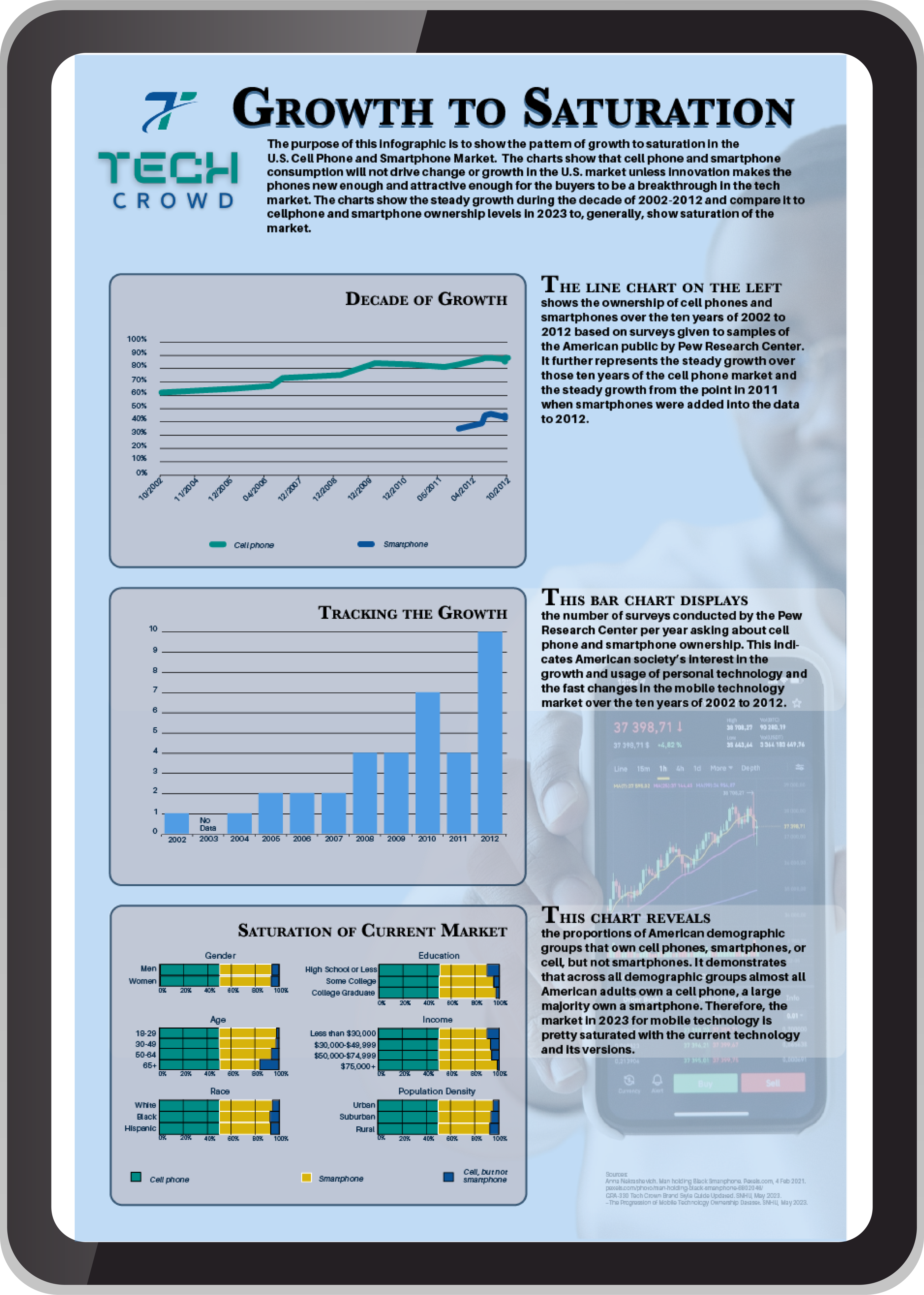
Click to read more about this DIGITAL DATA VISUALIZATION
I created this tabloid-sized (11″ x 17″) infographic for a digital magazine. Tech Crowd was a dummy tech magazine publisher with a target audience of Millennials, male and female, who are interested in “new data-driven information and creative content.” It was to replace a wordy written article but still tell the story.
I had to choose a raw data set and analyze it to create a story that would be interesting to the target audience. All the text in the four paragraphs is created by me and tells the story I saw in the data (click to see the process). All of the variables and their locations on the X/Y axes of the charts were my choice because they are what tells the story– beginning, middle, and end. The charts were created in Microsoft Excel for accuracy, then imported to Adobe Illustrator where I augmented the charts’ designs with the brand color scheme and my design choices.
The stock image with the charts was chosen from a service online (citations are in the design). The typography design was unique to my design. The serifed font for headings and emphasis was my choice to go with the brand sans-serif body copy. It uses a good hierarchy of information – the headline hints at the main plot of the story and the purpose paragraph supports the readers’ understanding of the story before they see the details. The charts show the data and the paragraphs next to each chart tell how the data tells the beginning, middle, and end of the story. The charts are organized to reinforce this structure. I picked the type of chart to match the data presented. I ethically presented the data with gaps appropriately noted so the reader could come to the same conclusion I did if they analyzed the raw data, too.
*Please zoom in to read the story of the data for the client and data set I chose.
Print Works
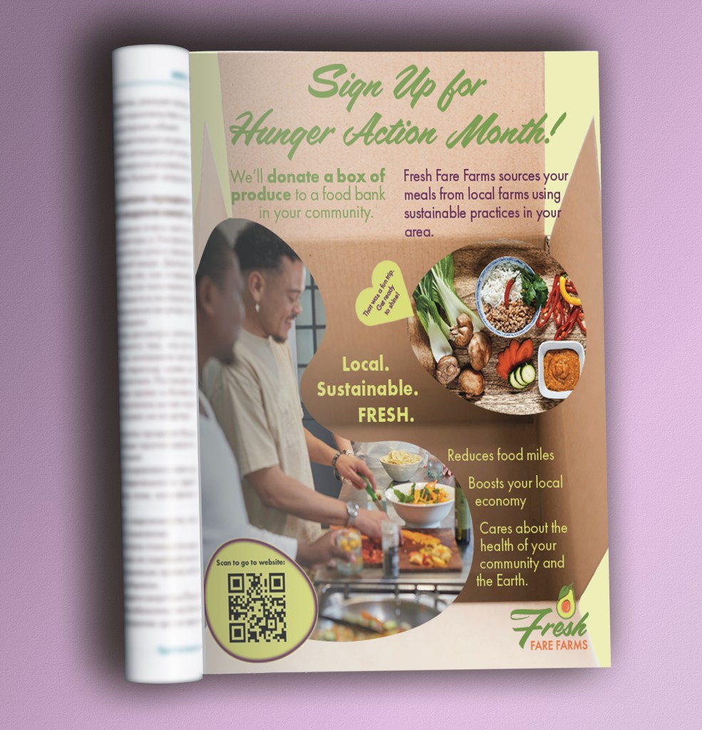
Image Attributions
Georg Regauer. Vegetable Salad on Brown Tray. Unsplash.com, 5 July 2021. unsplash.com/photos/vegetable-salad-on-brown-wooden-tray-qo0qBl6T7R8
Kelli McClintock. Brown Cardboard Box. Unsplash.com, 10 Nov 2019. unsplash.com/photos/brown-cardboard-box-DcoB_NoNl6U
Sweet Life. People Preparing Food. Unsplash.com, 3 May 2023. unsplash.com/photos/a-group-of-people-preparing-food-in-a-kitchen-PJUfpkA80eU
Click to read more about this MAGAZINE AD
This is the magazine ad from the multi-channel advertising campaign that had the digital ads from above (click to go up to the digital ads) in it as well. This magazine ad is the base of cohesiveness for all the other ads. I completed a competitor analysis of existing similar services and their ads. Fonts, brand colors, brand shapes and brand guidelines for imagery were provided. All images were my choice. By following the brand keywords, I used the image content to attract the audience with ethnic diversity and no reinforcement of social norms or gender roles.
It needed to be cohesive with all three forms of ads the client needed. Since it is an ad, it needed to be creative to catch the TA’s attention, hold the TA’s attention, and make them sign up for the meal kit service of Fresh Fare Farms. It also was for the TA of college students and young professionals who are too busy to go grocery shopping and meal plan, who want to eat healthy or learn to cook healthy food, and are between 21-35 years old.
I started by strategizing the two text-based messages the client wanted in the magazine ad. The CTA for the TAs to help their community was used as the headline because it is the the main message to achieve the client’s number one goal– to gain more customers. Then the client’s brand story educating the TAs about their company and their promise is in the body copy. I had the ability to severely edit the copy provided by the client due to the TA being young people who like short, simple messages. There were several tagline possibilities in the project brief. I chose the tagline of “Local. Sustainable. FRESH.” for all the ads due to it being shortest since the TAs prefer brevity. It educates the TAs about why Fresh Fare Farms is special. I wanted to differentiate the service from the competitors.
The third message in the ad is in the images. It explains the key points of the service and keeps the ad image-driven for the young TAs. I added this because I noticed a gap in explaining the service in the provided campaign materials. I added a CTA that is scannable in the form of a QR code so the young TA can easily get to the brand website and sign up for the service.
I used design principles such as contrast, scale, proximity, balance, and unification.
Contrast is used in the angular shapes and lines juxtaposed with organic food shapes and the brand shapes. This keeps the visual interest of the TAs. Additionally, I chose these brand colors specifically so the TAs can see the colors and the messages easily. Also, the different messages use all three brand fonts in different sizes and colors to denote different levels of importance, therefore the TAs know what to read first to understand what is going on in the ad.
Scale was used when I exaggerated the scale of the box over the people and food since the whole concept of the service is the delivery and convenience and the TAs need to know this. This makes the design image-driven, so the images are emphasized over the text the way the younger people like to view things. Proximity helps with the design to feel uncrowded, creates movement for visual interest, and pulls the TAs’ eyes down to read all the text. The balance is bottom heavy and achieves the same result as proximity for the text. Unification is achieved with bright colors which are echoed in the images, along with the straight edges of the box and geometry of the Futura PT fonts, and the curved image shapes and curves of the Filmotype LaSalle font.
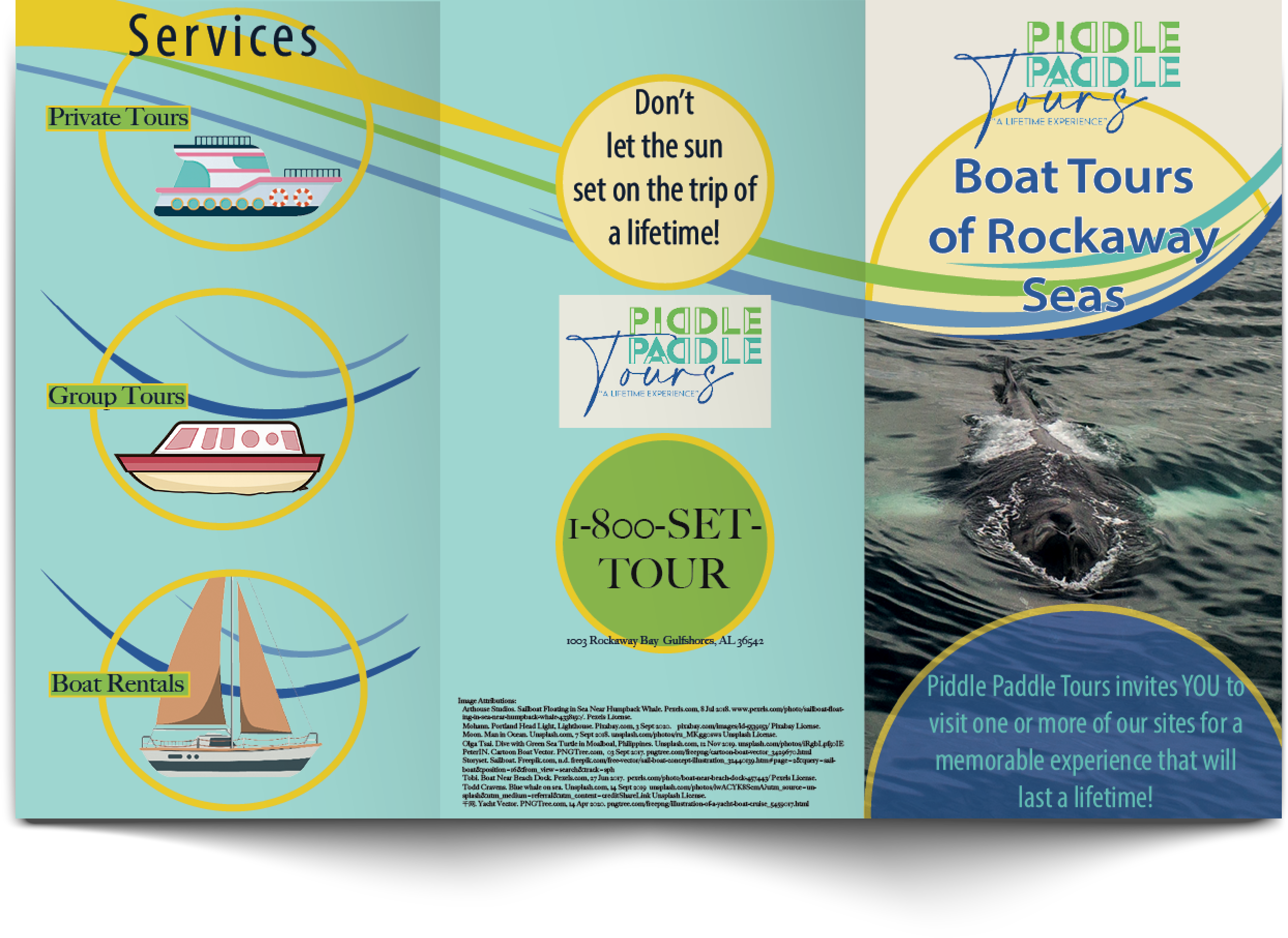
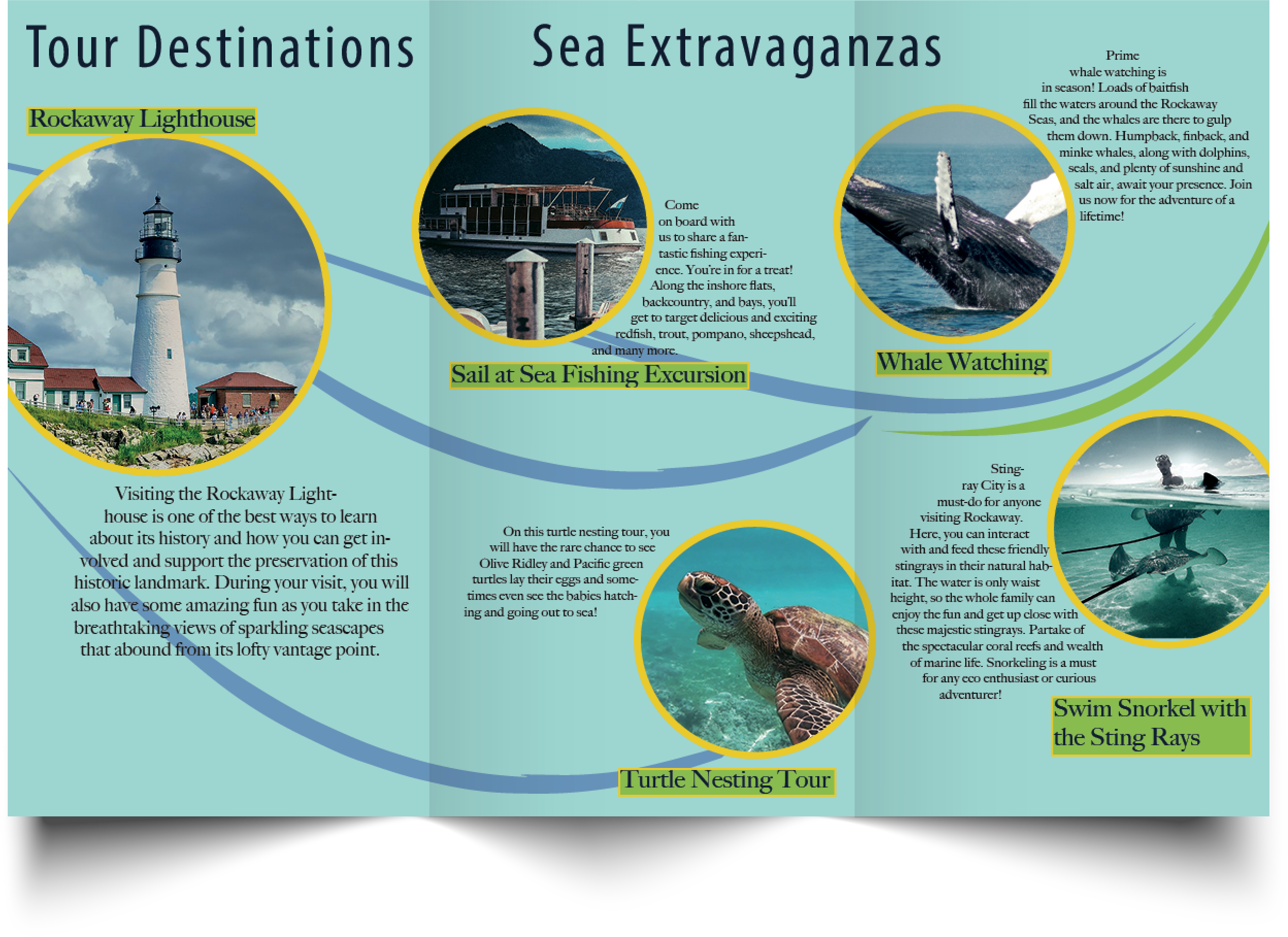
Click to read more about this GATE-FOLD BROCHURE
This is a tri-fold brochure and was focused on pagination and proper folding design in InDesign.
I had to figure out the size of the panels based on the fold pattern and apply folding compensation to the panel designs. I had to figure out what content would go on which panel for the fold pattern. The client/brief dictated the general content to be placed on the individual panels of the brochure, such as what went on the cover, the back cover, and the inside pages, but it was my choice how to lay it all out and design it. Photos and text content were supplied but I added all the illustrations and graphical content from files sourced from services online (citations in the design). Additionally, all typographic design choices were mine apart from the logo. I also, created the color scheme based on the logo with additional contrasting colors added. To satisfy the technical printing requirements, I pre-flighted and packaged the design for printing. All images and graphics taken from services on the internet were converted from RGB to CMYK. I added registration marks for folding, crop marks and a bleed to optimize printing output. Furthermore, colors were spot checked for CMYK.
 Mr. Rakoon Studio