
Professional Work
Client Testimonials
“Rakan’s dedication was evident throughout our project. He was always open to feedback, and his ability to adapt to my needs made the process seamless. I’m thrilled with the final product and would happily work with him again.”
–Dr. Sage M. Park, CEO Milestones, Inc.
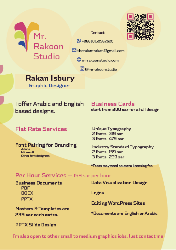
For Hire Saudi-Based Freelance Graphic Designer…
…and a collaborator & hardworker who values the dual agency of the design process, is authentic, tenacious, and has perseverance to find the best solutions to solve your problems.
- Business Cards
- PowerPoints
- Logos
- Posters
- Flyers
- Magazines
- Documents
- Digital Catalog/Catalogues
- Brochures
- Ads
- Brand Collateral
- Invoices
- Letterheads
- Envelopes
- Forms
- Templates
- Data Visualizations
- Reports
- Editing of WordPress sites
- UX/UI of Websites and Apps
Above are the types of designs I can visualize how you want:
See my work below
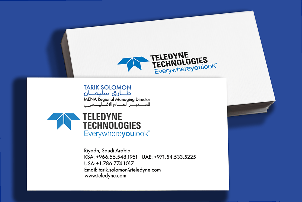
Click to read about MENA Regional Managing Director’s Business Card
Dr. Sage Park, who was an accommodating, happy client, and who praised my work for her, referred me to Mr. Solomon to design his business card. The business card project was interesting in that there were brand guidelines to follow but the client wanted to add his own flair. The guidelines stated leading height for all lines of text, font sizes for name and title in English text, the Teledyne brand blue and generic black, measurements for alignment, and English font family, Futura. They were contradictory about the color of his name.
He wanted a special business card with English and Arabic name and title, and it was a challenge to make four lines of text in the space for two lines. He also requested the contact information leading to be “fixed” and the addition of his US phone number.
Since design is complex, his eyes believed the spacing of the contact information “felt” uneven. He didn’t know typographic factors affect optical spacing and that his eyes and brain interpreted what he saw through the comparison of visual aspects. Therefore, I explained fonts, language structure, and restrictions of space. These changes were challenging. I was proactive about possible design decisions so he could make better decisions. I made options to help him see leading, and font size possibilities. After deciding on an option, he asked me to add panache by stretching the Arabic. Furthermore, the duration of the project became open because he was busy.
Refinement and Application of Corporate Branding
This client runs a small, US-based corporate executive coaching and leadership training business in Saudi Arabia. Initially, she approached me to refine her business card with the overall directive to create an accessible design.
This lead to us collaborating on font changes and color changes to enhance contrast and attractiveness. Her target audience are mostly 45-55 year old executive men in positions in Saudi Arabia.
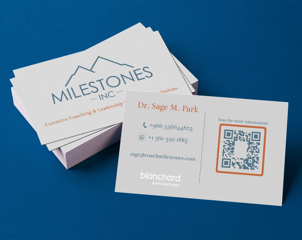
Click to read about the process of refining the CEO’s BUSINESS CARD
I worked with an existing business card design created in Canva by Dr. Park. The original design had the QR code on the left and her name at the bottom of the frame of the QR code and there was a glaring white background stealing the attention away from other information. The tagline was top right and taking up significant space. The QR code frame and the text on the reverse side were not the same color as the logo. The font was just Times New Roman without any thoughts of proper pairing with the logo font. The information people should see first, like her name were overpowered in the unclear hierarchy. Additionally, the whole card had a random grey background that was too dark for proper contrast with the green-blue brand color. Overall, the design felt cluttered and mismatched as well as not being organized for the older target audience Dr. Park aims her services at.
The card was reorganized for better emphasis on important information and removed distracting visual information.
I matched the color of the text and QR code to the logo and removed the white background from the QR code so it wasn’t so visually overpowering. The QR code, the Blanchard logo, and Dr. Park’s contact information had to be together. Therefore, I moved the tagline to be with Milestones, Inc. logo on the front. I took her name out of the QR code frame and put it as the focal point of the information and now had space to make it larger. I put the text information to the left knowing the older target audience would read before scanning the QR. I put UI/UX efficient guiding text over the QR so the TA knew why they were scanning it.
I had a choice to choose and add a complementary burnt red-orange to the branding and apply it on emphasis points. I chose to emphasize her name and the frame of the QR code. This makes them catch attention and viewers know they are connected somehow. I also, chose a better, more attractive, specifically paired*, serifed font to go with her logo font. (*Read about the pairing of fonts below). Lastly, I brighten the grey background to the photographically-neutral 18% and this gave good contrast to all the colors and made them more accessible.
The choices in the business card became the basis for further branding. She needed her training materials to be as well-designed as her business card.
This project evolved and changed a couple of times over the 4 weeks it was live. At first, Dr. Park requested only edits to the course marketing documents for 11 of her courses, and to change them to a MS Word template, as well as to make templates of the first pages of other documents in her courses. Plus, she wanted me to create introductory and sign-off slides for her PPTXs.
Then, due to an accelerated schedule on her part the brief changed to include, adding her branding, redesigning some parts, and overall, generally editing all course materials (DOCXs, PPTXs and PDFs) for 4 of the courses that she wanted to use right away. I also, made additional templates for her to be able to edit some things herself for any future courses. I was flexible with Dr. Park because she is a small business owner who needs support and she knew exactly what she wanted and made quick decisions when presented with drafts.
Total deliverables for this project ended up being: 11 course marketing DOCXs and a template, 2 course overview DOCXs and a template, 4 PPTXs and a master template, 4 multi-page PDFs and a redesigned, reusable first page for the case scenarios PDF, 3-60+ page participant manual DOCXs and a first page template, 2 Action Plan DOCXs and a template. Plus, I edited and created numerous images within the DOCXs, the PDFs, and the PPTXs.
During this project’s process I learned how to design, organize and make templates of designs in MS Word and Powerpoint (PPTX). This is a very different process and was difficult to get consistent, stable results. However, small businesses who don’t have the money to spend on expensive design software or the time to learn other user-friendly design applications need design solutions that they can implement and easily edit as templates to keep their business running and up-to-date.
Click to read about these PPTX OPENING and CLOSING SLIDES
These 2 slides are a remix of Dr. Park’s corporate identity from her business card. My thoughts when designing the opening slide was its purpose as introductory and a bridge between the instructor and the training participants. Additionally, I thought of how it helps support the professionalism of the training by showing a unified and carefully designed company identity. I advised Dr. Park on which photograph she could use and my choice was based on her blouse color matching with her brand orange and having high contrast with the grey background. I also cropped said image for attractiveness and clarity. I decided to make a significant change by adding another sans-serif font, Bahnschrift, to be used for Dr. Park’s name since her course participants are Arabs who could have never encountered an English name before but should at least be able to recognize the letters clearly.
I also considered the closing slide’s purpose as a wrap up and encouragement for further connection and contact. To this end, it was decided to have the QR code from the business card scaled up and be most important on this slide.
These slides are part of a master PPTX template I created and I supplied her with instructions on how best to use her new template since as a training service she will always add new courses and would want the PPTXs to easily match her branding without having to spend more money on design services.
Click to read about the FONT PAIRINGS for this project
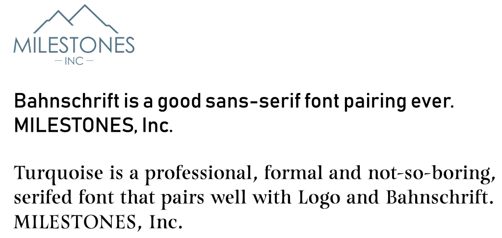
The font pairings created for Milestones, Inc. are all based off of the logo font. The logo font is a highly modified sans-serif font with medium weight, even strokes, mixed geometry, and a tall x-height designed specifically for Milestones, Inc. All of these factors came into play as I paired her main font, Turquoise, with the logo. Turquoise was chosen because it was obviously different from the logo font, had the same x-height, and matched the logo font in stroke weight in its middle size, but has thicks and thins within the letters. Additionally, since her business is human-oriented, I chose a font with calligraphic serifs, so as to give it a natural quality as opposed to machined.
Bahnschrift is a sans-serif font chosen for body copy and smaller text on screens. Its strokes are thicker than other fonts like it inherently, which makes it appear bolder and have better visibility on screens and therefore better accessibility. It needed to be easily available in MS Office products due to Dr. Park needing to edit the templates I made for her. Therefore, I chose from that font list. Its structure matches the logo font in that it has the same x-height. Bahnschrift has fatter stroke weight compared to the logo, but it is not an extreme difference. Bahnschrift also matches Turquoise’s widest stroke weight, and both Turquoise and Bahnschrift have different counterforms to the logo font.
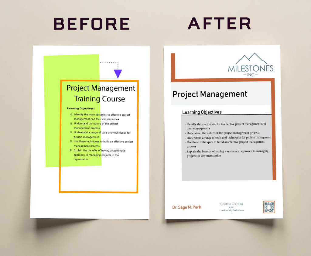
Click to read about COURSE MARKETING DOCUMENTS
These 11 documents started out as a DOCX template redesign to be used by the client for any future courses she may offer. The headline and body copy parts can be edited easily in MS Word. The template used the company logo and new brand colors and a tint of the brand green-blue to demarcate the space in the page for easy reading. It needed to follow a corporate design style as the executive target audience expects. Also, it uses the brand fonts in a way that is accessible for printed materials– headings are the sans-serif, Bahnschrift, and body copy is the serifed main font, Turquoise. According to Deer (p. 153, 2016) serifs change the shape of the letter and this helps readers to distinguish letters from one another because there are more visual differences that help character recognition which makes the design of this document more accessible. Additionally, I added a footer so clients knew who to contact and how to contact her in a neat, easy way. Furthermore, following the request of the client, I made small changes to the language to be more standard and Americanized. After designing the template, I copy/pasted the text for 11 courses and the template offers consistent, stable results each time it is edited. This consistency and ease is important for the small business owner so they don’t waste time on minutiae.
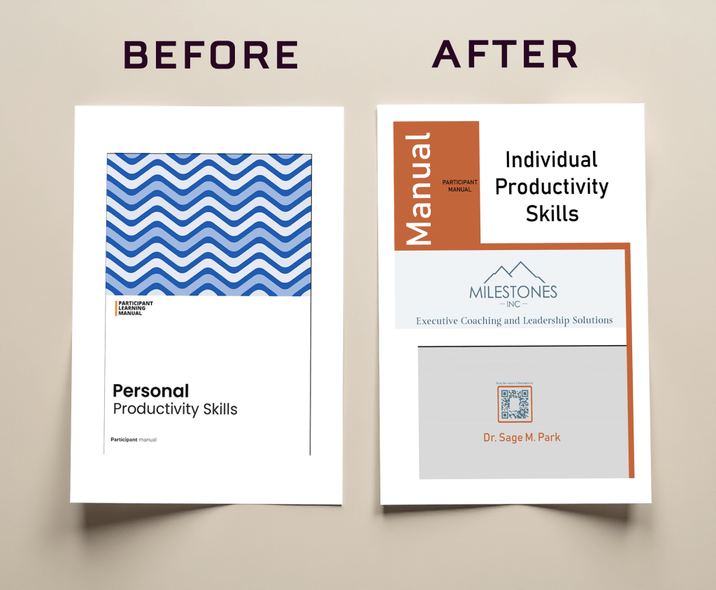
Click to read about the redesign of the PARTICIPANT MANUALS
The cover page for the participant manuals was designed as a template as well. It is different from the template designed for the course marketing documents, but stays true to the tone of the branding in that it takes the general structure, use of fonts, and colors from the marketing documents, while adding the vertical text in the rectangular element that was taken from the case scenario cover page design . I thought about how the design of the manuals are more geared toward confirming to the trainee that they have the right manual for the right course and to encourage reconnection. This template was also designed in MS Word and acts as a template to be edited for future courses because the headline can be easily changed.
In addition to designing the cover page, I was tasked to change all fonts and colors and unify the text hierarchy throughout the 3 versions of this document, 1 each for different courses, to fit with Milestones, Inc. branding. Additionally, I was to remove some original design elements in the documents to make it more attractive and streamlined. I also removed redundant material/words/images throughout the documents and any parts deemed unnecessary by the client. Furthermore, with this particular version, the client asked me to edit the entire document because the title of the course was changed from “personal” to “individual” productivity. This meant I had to go through the 65-page document and change the use of “personal” to “individual” where appropriate. This change was to make the course more professional context oriented.
Click to read about these REDESIGNED SLIDES
These 4 JPGs from the PPTX for the Individual Productivity course had to be redesigned. I changed “personal” to “individual” because the name of the course changed. Since these were images and not graphics created in Powerpoint, they had to be edited in Photoshop. I had to visually match font, font size, and color in each image where the words are, because being an image, I could not detect from the software these aspects. I also made sure to scale the JPGs up for quality in larger screens so it wouldn’t become pixellated when projected.

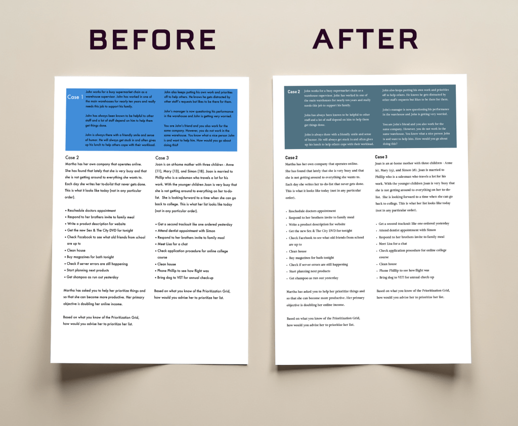
Click to read about this page of the CASE SCENARIO PDF
This page of the case scenario document was redesigned and was to be used as a replacement cover page for all courses Dr. Park facilitates. Initially, I was just to edit this page. The first edit was that a more-relevant-to-the-Saudi-working-environment picture needed to be added. The picture needed to be culturally sensitive and diverse, and it had to be high quality, properly sized, and not skewed. The image also had to echo the main Milestones, Inc. brand colors. The picture had to have a commercial license so it could be used in the future as a Milestones, Inc. asset. Several stock photo services were searched and an appropriate photo was found. I kept the vertical text rectangle next to the image, but changed the size, color, and the fonts therein to match branding. The body copy was changed to the main brand font, Turquoise, and the brand orange was chosen for the cover page because it was more attention-grabbing, and matched the templates thus far made. The pull quote was removed as it had nothing to do with the content of any course. The client agreed and it was replaced with the footer.
Click to read about this second page of the CASE SCENARIO PDF
This page was added to the project when it was noticed that the text alignments were not easy to read and that Dr. Park needed the whole document to be perfect quickly. In this page, I applied the brand colors and fonts to the color block and headings and body copy. I also changed the color of the writing in the color block, plus, fixed the sizes and alignment of the text from justified to left for accessibility purposes, such as ease of reading and contrast.
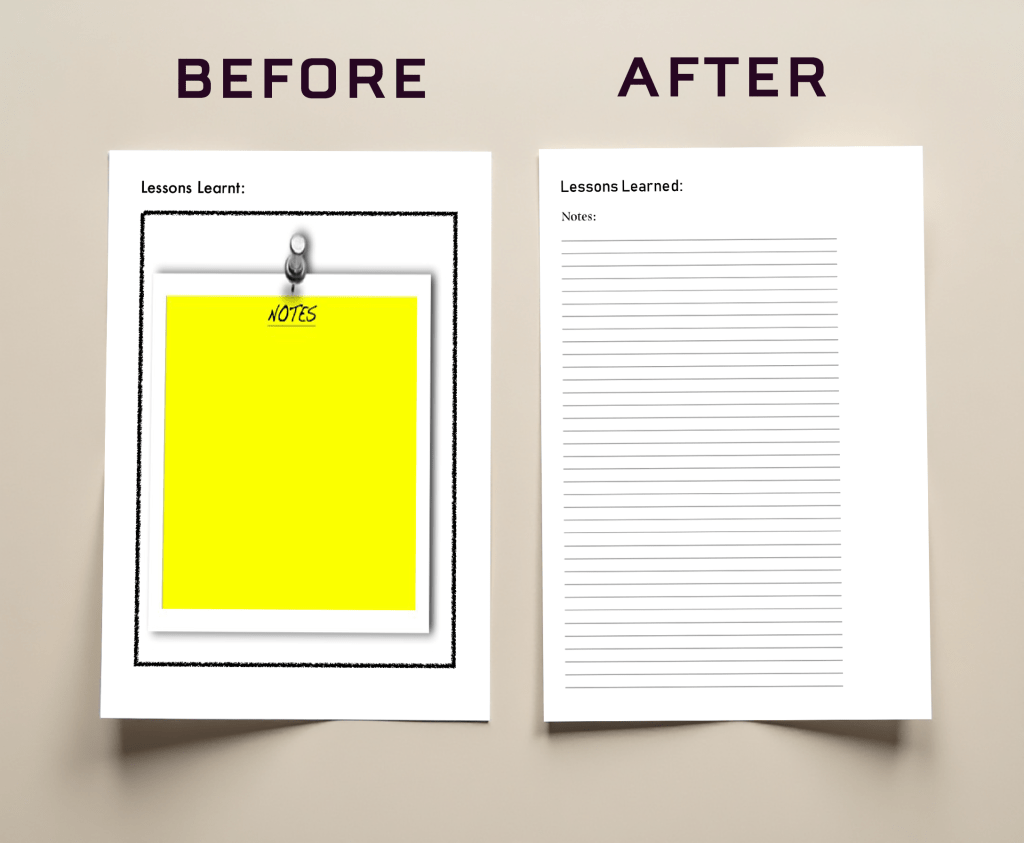
Click here to read about this third page of the CASE SCENARIO PDF
With this page, there was an unattractive “notes” image that wasn’t fitting with the tone of Milestones, Inc. brand. I replaced that image with simple lines and headings using the brand fonts as well as changing the British English “learnt” to the more standard, American English “learned”.
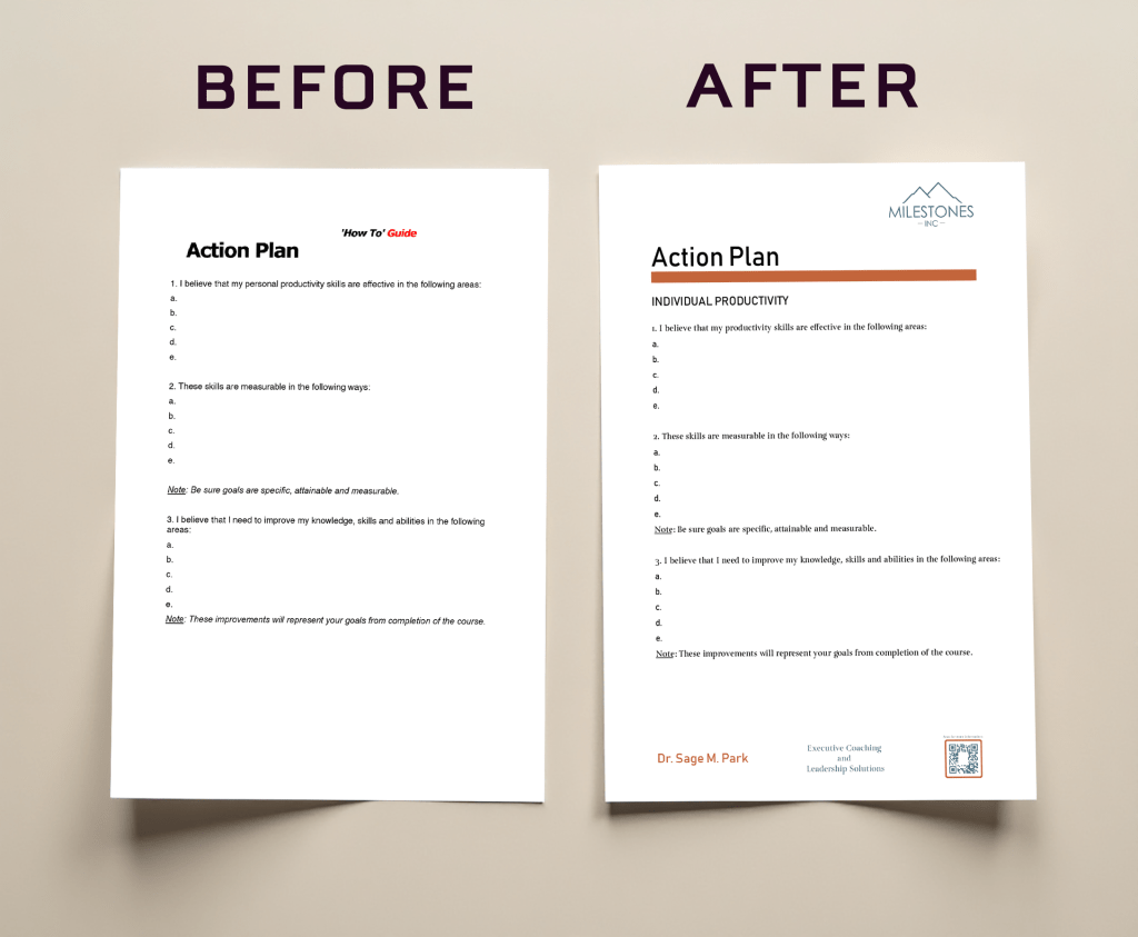
Click here to read about the ACTION PLAN TEMPLATE
The action plan was originally inside the participant manual and the client requested it also be a separate 3-page document. When I reformatted it to stand alone and be a template, I added her logo, footer, and changed the text to her fonts appropriate for printing, Bahnschrift heading and Turquoise body copy. Because it is a template, I gave it a subheading that could be changed with each course. I deleted the extra nonsense text of “How to” Guide” as it had no place in Milestones, Inc. branding. I also added an orange stripe to echo the previous templates.
Click here to read about the redesign of these DECISION TREE SLIDES
These 5 slides were part of a set of slides in the Strategic Decision Making course PPTX that the client facilitates, and that she added to my tasks as a redesign. The original slides used a circle, a square, and a line to communicate the complex information. I color coded the information instead with Milestones, Inc. branding colors and an additional green of the same purity and saturation to blend in, to make it visually neater. Additionally, to make the information clearer, I put the labels inside the colored rectangles, and added more labels, i.e. main question, decision points, and uncertainty random.
I had to understand without explanation beyond the course materials themselves what the charts were trying to teach. The redesign is based on my understanding that a person has to have a main question and options to make a decision and points where the decisions would be, in order to come to solutions that would come from those decisions, and that there will always be uncertainty and randomness that will happen in the process. Furthermore, I added the proper mathematical notation for probability to indicate outcomes. This is a graphic created in Powerpoint using the chart options. I was done this way so that Dr. Park could easily edit it in the future as needed.
