
In this project, I had to create a stand-alone visual story with three charts using existing brand data and target audience information.
Collecting Required Visual Elements

These are the brand colors for the dummy magazine of “Tech Crowd,” the brand fonts plus one I chose (Baskerville), and all the logo do’s and don’t’s I had to follow.
Data Set Chosen
I chose the “The Progression of Mobile Technology Ownership” topic because I like to know about historical trends in technology and wanted to inform others about the topic in an easy way. Moreover, knowing the market is stagnant will affect my future purchases of mobile phones, because there are no real breakthrough changes in the tech recently.

The data for the project and topic I chose was already organized but raw; given in six Excel data sets. These sets are what I analyzed to come to my story. I used all six sets.
Analysis Notes

I analyzed to find the data story that was insightful to the target audience of Tech Crowd.


The first page of notes are how the target audience connects with the mission and vision of the magazine and guidance related to how I approached choosing design elements for the target audience. The second page of notes is what I connected to come to an insightful story the target audience wanted to see. The notes were trying to figure out how I could interest the TA in a saturated market.
Using Excel to organize data accurately into charts


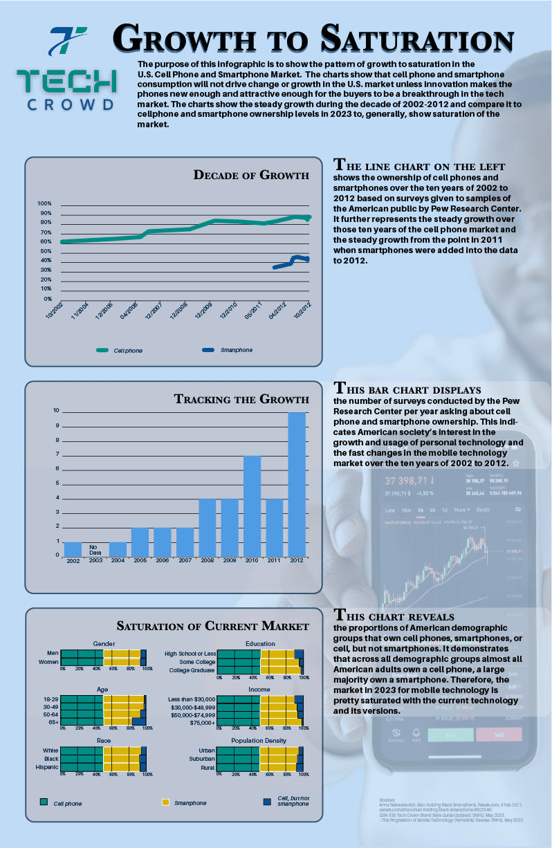
The first chart in my story was a line chart.
- The X-axis is the years, 2002-2012.
- The Y-axis spans from 30% to 90%. This set of values shows the two extents of the ownership of smartphones and cellphones while adding a bit to make them visible in the design.
The line chart shows a trend over time. Ownership of cellphones and smartphones over the ten years from 2002 to 2012 is the relationship the chart shows.
The second chart was a bar chart.
- The X-axis is the years 2002-2012.
- The Y-axis spans the extent of the numbers of surveys per year, 1-10.
The bar chart shows the number of surveys per year for comparison.
The last chart was a Horizontal grouped stacked column chart (changed to a set of small multiples of the same type of chart to simplify the information):
- For the scale, I used two axes, X and Y, but they are flipped.
- The X-axis is vertical and show the demographic groups.
- The Y-axis is horizontal, at the bottom, and spans 0% to 100%.
The horizontal grouped stacked column charts shows the proportions of the demographic groups that own a cellphone, smartphone, or cell but not a smartphone and be able to compare the proportions.
I used Excel to plot the data into charts to make sure the data was accurately represented. Excel made it easy to control what data subset was on the X or Y axis of the charts. After Excel gave me the accurate chart, I exported the Excel chart to Adobe Illustrator. In Illustrator, I changed the size of the charts, the colors (foreground data and the scale lines), and the fonts in the charts. I added text where needed to explain data gaps. I added labels to replace the generic Excel numbers and symbols such as the percent sign.
Typography


The set of images above shows my tests of font pairing and drop shadow placement for legibility.


The first image had all elements in rough placement. The second image was perfecting alignment of all elements in the charts and text. The last image shows the addition of details for contrast, clarity and emphasis.
